Case Study
Global Carbon Pricing Dashboard
Transforming a dense, multi-layered dashboard into a clear, narrative-driven experience that reduces time to insight and improves adoption for analysts and decision makers worldwide.
The Problem: What Users Faced
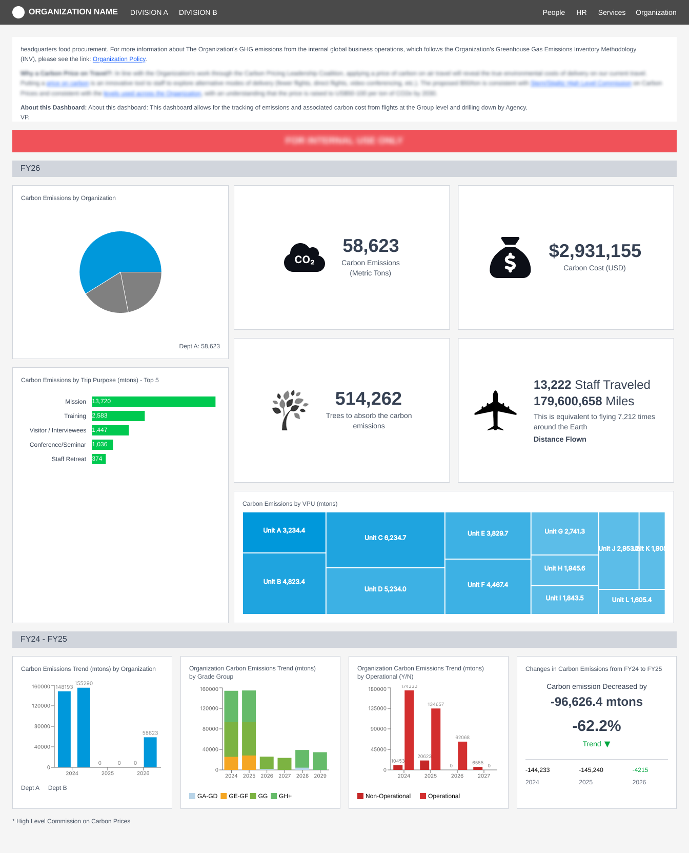
The original dashboard tried to show everything at once. It felt heavy and scattered, forcing users to scan multiple sections just to answer simple questions. The content was powerful, but the structure did not guide the user. Analysts and decision makers needed something clearer and more intentional.
Why This Redesign Mattered
Global carbon pricing data can be complex, especially when it includes emissions coverage, aviation-related activities, instrument types, revenue, and year-to-year changes. The challenge was not the data itself, but how it was delivered. The legacy design had no clear story, no path through the information, and no consistent pattern to help users know where to look.
This redesign focuses on turning that complexity into something simple to understand. The goal was to help users think, not decode.
- Reduce time to insight across all user workflows
- Reduce cognitive load through clear hierarchy and hierarchy
- Improve adoption for both expert and first-time users
Competitor Analysis
I reviewed three platforms that align closely with the idea of presenting climate insights clearly
Watershed
A h3 example of narrative dashboards. Their KPI-first structure informed my approach to clarity and storytelling.
Persefoni
Known for transparent data modeling. Their layouts demonstrate the value of consistent components and predictable patterns.
CarbonAnalytics
Focuses on deep comparisons across complex datasets. This influenced the pattern for aligned country KPIs and comparison tables.
These comparisons confirmed the importance of hierarchy and clarity.
They also highlighted a gap
None of these tools focus specifically on global carbon pricing and policy coverage, which is where this redesign stands out.
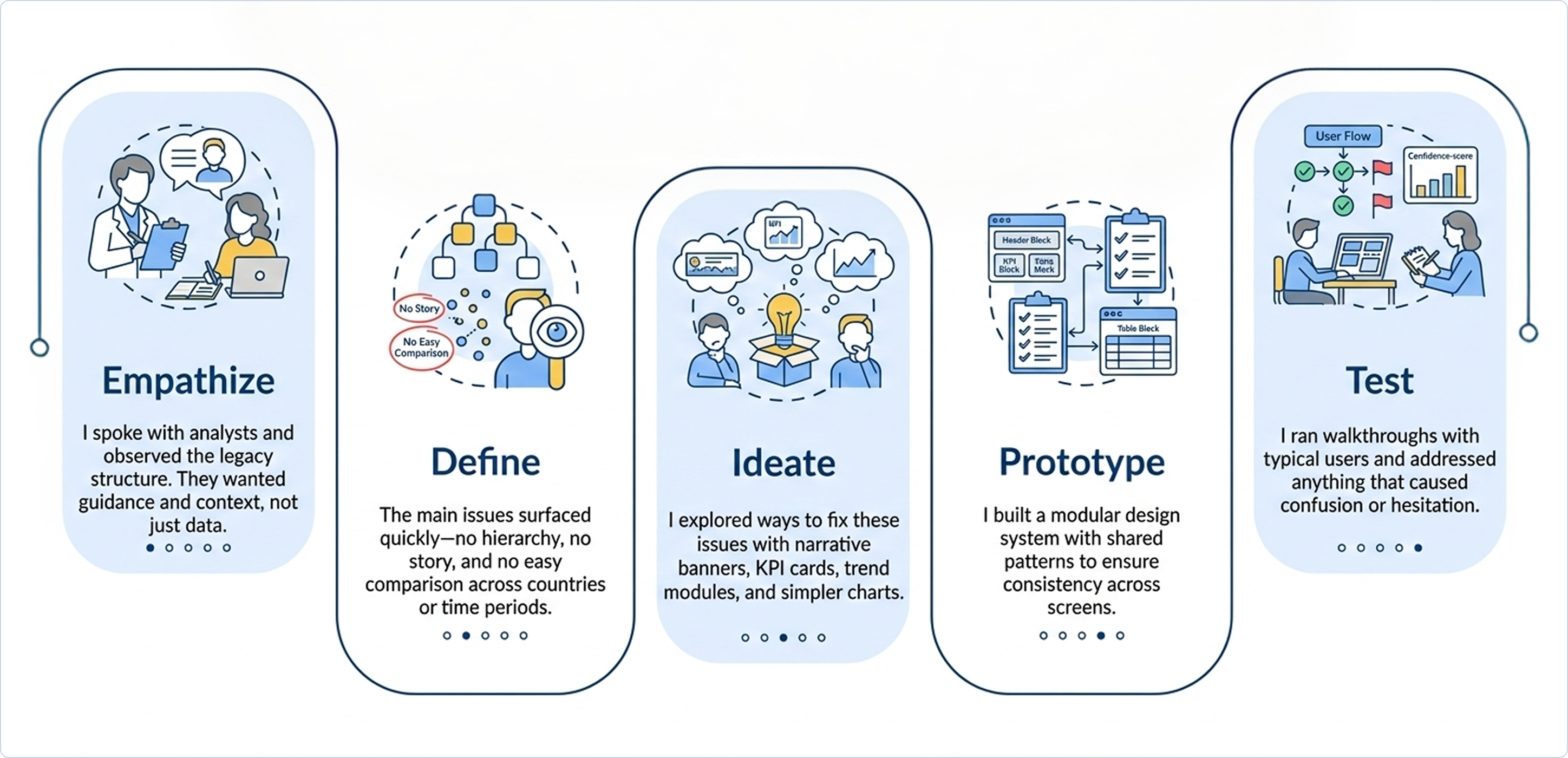
Design Thinking in Action
I used design thinking as a simple guide through five steps to ensure the redesign addressed real user needs
The Redesign
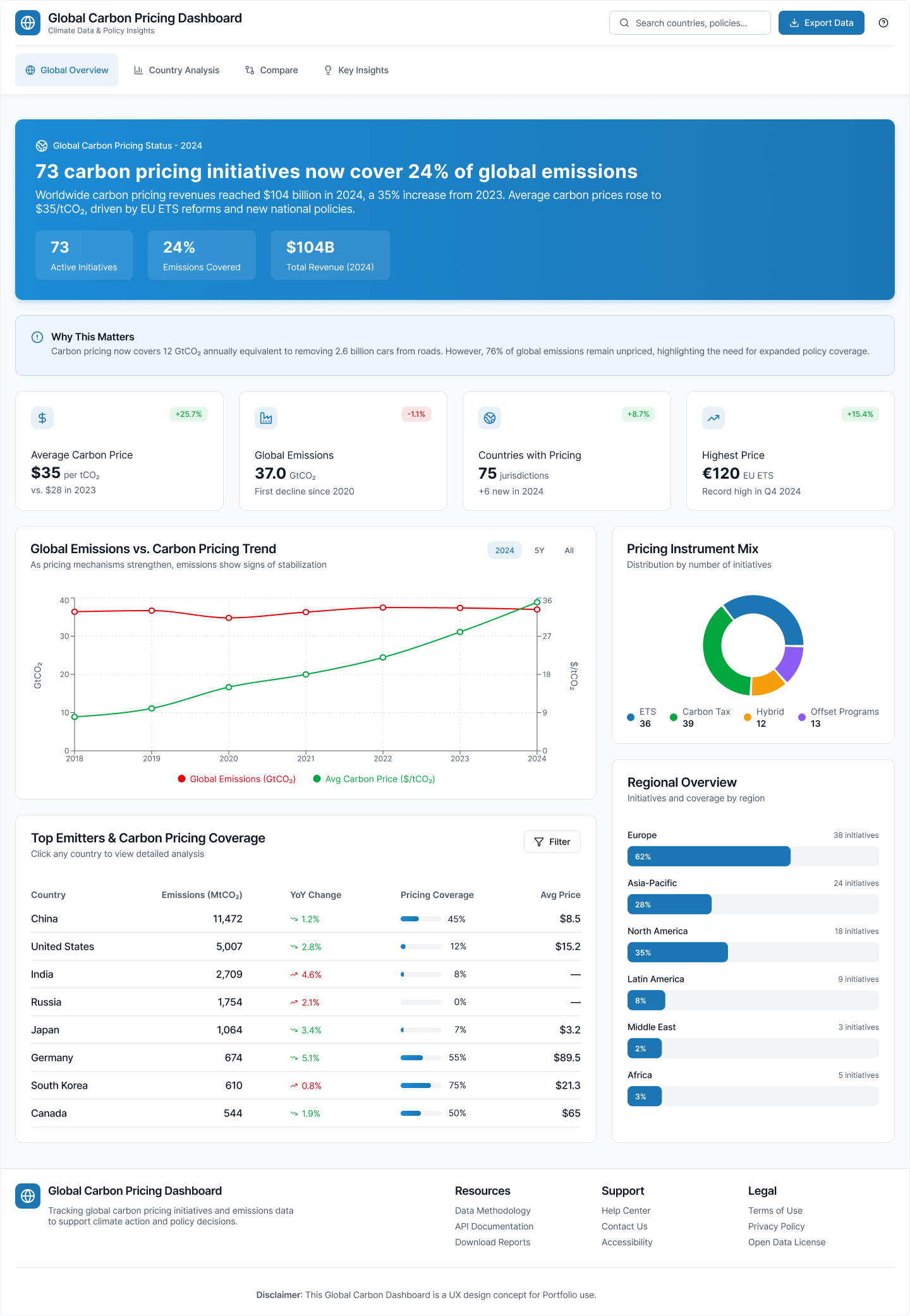
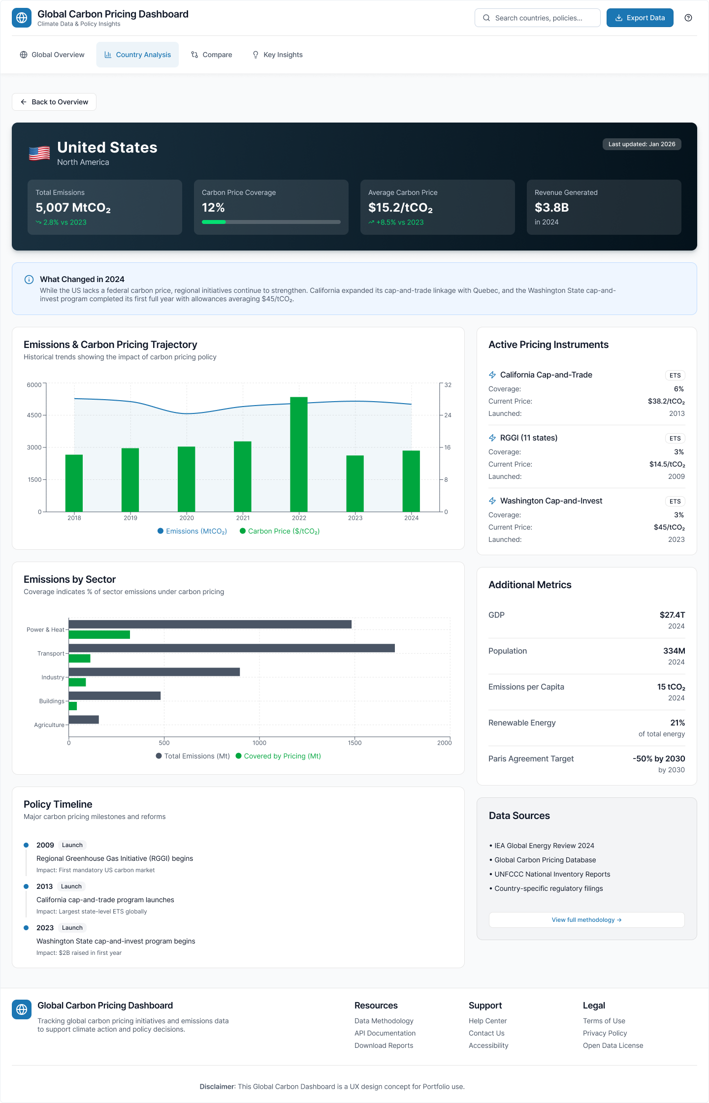
Below are the four core redesigned screens. Each one is crafted to support faster understanding and easier exploration.
This screen introduces the global story. It begins with a strong insight banner that explains the main update. This is followed by clear KPI cards and then a combined emissions and pricing trend. The screen also adds a simple donut chart for instrument types and a clean table for top emitters. A summary note at the bottom explains why these numbers matter and what changed.
This page focuses on understanding one country in depth. It starts with four key KPIs, then a short summary that explains what changed. A clear trend chart compares emissions and price over time. The page also highlights active instruments, sector coverage, macro indicators, and major policy milestones. Everything is structured in a simple flow that helps users form a complete picture.
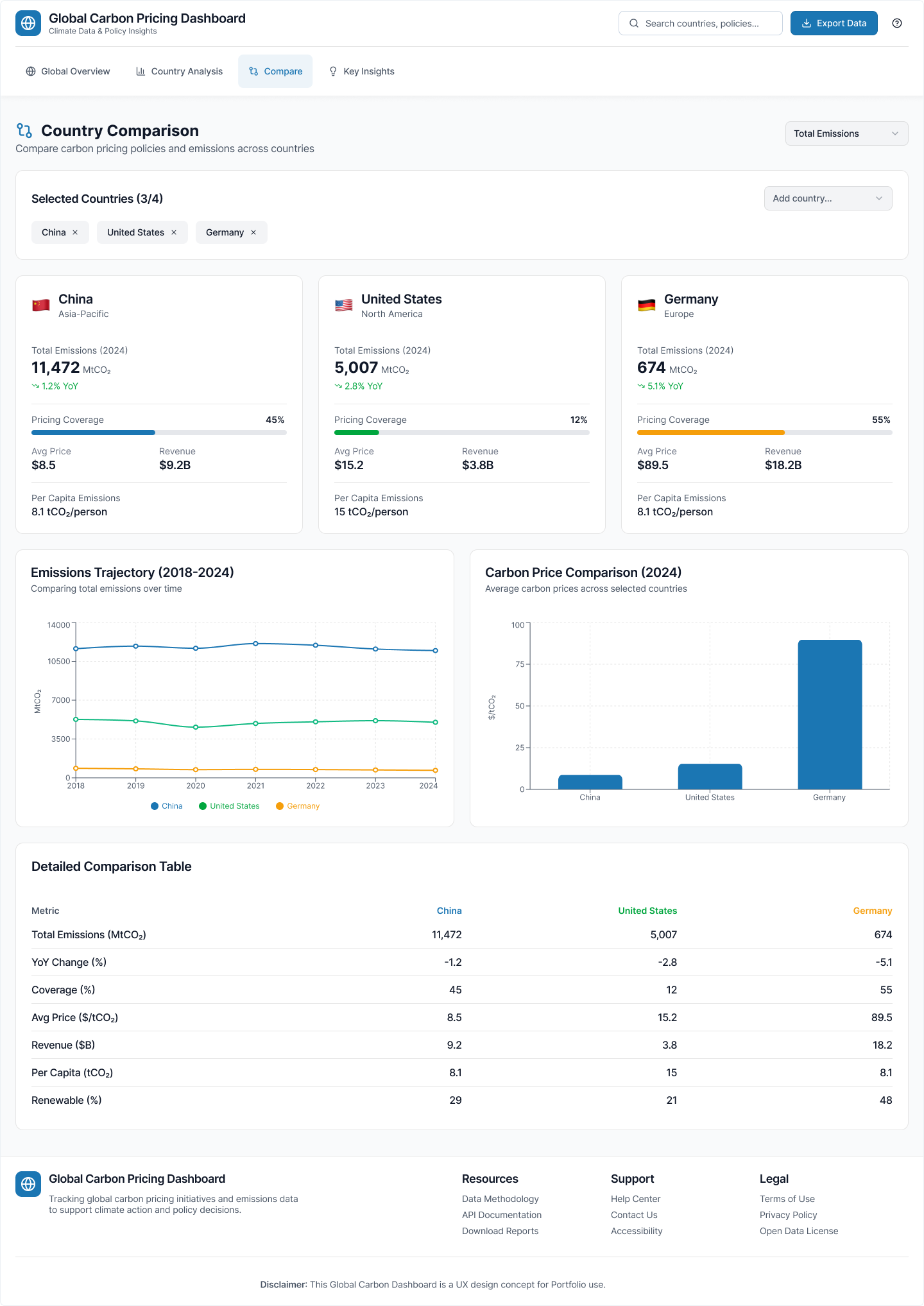
This view supports cross-country learning and benchmarking. Users can add or remove countries with simple chips. KPI cards follow the same layout for each country, so comparisons are fair and consistent. Trends use aligned years and the same scales. Prices appear in a simple bar chart for quick visual comparison. A detailed table shows exact values with clear notes and methodology.
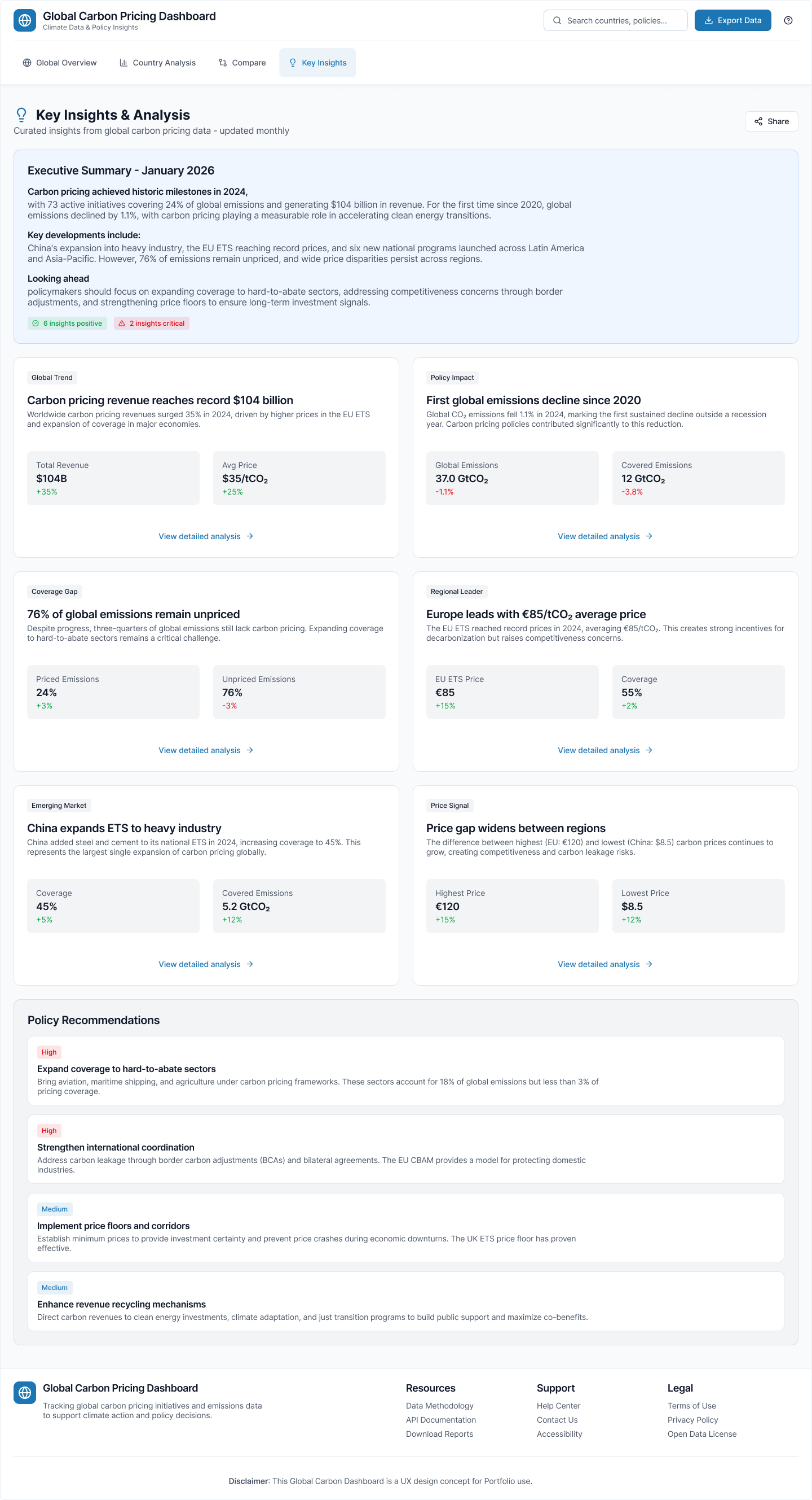
This screen translates raw data into meaningful insights. It highlights positive and critical signals. It includes cards that explain trends, revenue changes, and regional movements. It also shares actionable policy suggestions and notes the methodology for transparency. This view turns analysts into decision makers.
Impact: Measured Outcomes
To understand the value of the redesign, I tested the prototype with typical user tasks: identifying high-price countries, reading coverage changes, and finding regional trends. The results were clear:
Users could answer key questions significantly faster with the new structure and narrative focus.
Clear hierarchy and consistent patterns made the interface feel simpler and less overwhelming.
New users could complete tasks accurately without extensive training or support.
Users were more confident sharing insights, indicating higher stakeholder value.
These results show that the new structure helps users understand the meaning of the data faster and with less effort.
What I Learned
- Climate and pricing data is difficult only when the structure is unclear. The moment a story leads the page, everything becomes easier to follow.
- A simple insight banner does more work than a crowded set of charts. Narrative context turns data into meaning.
- Good hierarchy helps users learn faster and explore deeper. Consistency in patterns enables confidence and independence.
- Testing early and often prevents rework. Small adjustments during prototyping save major restructuring later.
- Experts and novices have different needs, but both benefit from clarity. A well-designed system serves both audiences simultaneously.